Signs That Don't Work
City Jeans is a clothing store that sells urban style clothing. I believe that the font used for the sign does not represent the definition of "urban" because when we think of the term, we often associate it with a bubble letter font.
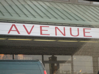
Avenue is a clothing store that sells plus size clothing. I believe that this sign does not work well because the font is slender, representing the opposite idea of the clothing that it sells. If I was a customer looking to buy plus size clothing and saw this sign from faraway I would be turned away because there is no indication of plus size clothing.

This Chase sign was photographed near the highway in Yonkers. I believe it is used to catch the attention of drivers, if so then it would not be a great idea to position the letters in a way that would be hard for drivers to read.
Signs That Do Work

This Toys R Us sign like every one of their signs can be seen from faraway. The font and color works very well because the bubbly character of the letters represent the playfulness

GNC is a store that sells health related products. The fonts used in this sign works well because it is concrete and has seriousness to the the letters "GNC." The font of "Live Well" balances out with the seriousness of "GNC, " almost giving the entire sign an impression of take your health seriously by doing that with their products. The white of "Live Well" also works well with the gray background.

Macy's is a popular department store. This sign was photographed at Yonkers, it faces the highway which makes it work well. The size and familiar font of the sign will draw attention to any customers of this department store.


 City Jeans is a clothing store that sells urban style clothing. I believe that the font used for the sign does not represent the definition of "urban" because when we think of the term, we often associate it with a bubble letter font.
  Avenue is a clothing store that sells plus size clothing. I believe that this sign does not work well because the font is slender, representing the opposite idea of the clothing that it sells. If I was a customer looking to buy plus size clothing and saw this sign from faraway I would be turned away because there is no indication of plus size clothing.
 This Chase sign was photographed near the highway in Yonkers. I believe it is used to catch the attention of drivers, if so then it would not be a great idea to position the letters in a way that would be hard for drivers to read.
 This Toys R Us sign like every one of their signs can be seen from faraway. The font and color works very well because the bubbly character of the letters represent the playfulness
 GNC is a store that sells health related products. The fonts used in this sign works well because it is concrete and has seriousness to the the letters "GNC." The font of "Live Well" balances out with the seriousness of "GNC, " almost giving the entire sign an impression of take your health seriously by doing that with their products. The white of "Live Well" also works well with the gray background.

